penguins %>%
  ggplot(aes(species, bill_depth_mm)) +
    geom_violin() +
    geom_boxplot(width = .2) +
    ggtitle("Verteilung der Schnabeltiefe",
            "in den Spezies Adelie, Chinstrap & Gentoo") +
    theme_minimal()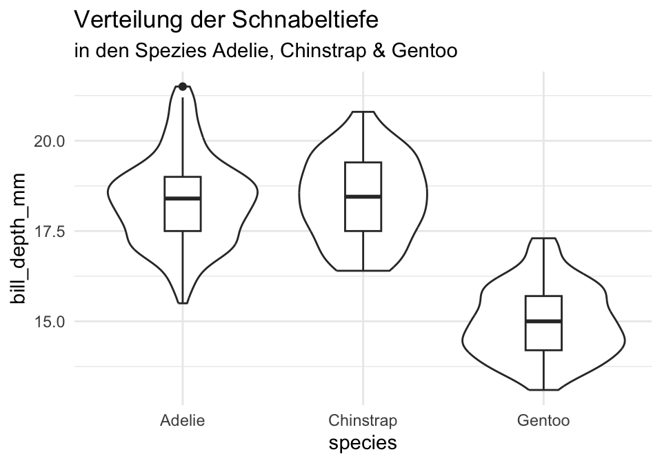
{ggplot2}-PaketDas -Paket {ggplot2} basiert auf der Idee des Statistikers Leland Wilkinson (2005), alle Grafiken mittels einer “Grammar of Graphics” systematisch beschreiben zu können indem man Visualisierungen in Schichten (Layers) zerlegt.
Hadley Wickham implementierte diese Idee in und veröffentlichte {ggplot2} im Jahr (2010).
Er beschreibt diese Komponenten in seinem Buch ggplot2: Elegant Graphics for Data Analysis (Wickham, 2016) wie folgt:
All plots are composed of the data, the information you want to visualise, and a mapping, the description of how the data’s variables are mapped to aesthetic attributes. There are five mapping components:
- A layer is a collection of geometric elements and statistical transformations. Geometric elements, geoms for short, represent what you actually see in the plot: points, lines, polygons, etc. Statistical transformations, stats for short, summarise the data: for example, binning and counting observations to create a histogram, or fitting a linear model.
- Scales map values in the data space to values in the aesthetic space. This includes the use of colour, shape or size. Scales also draw the legend and axes, which make it possible to read the original data values from the plot (an inverse mapping).
- A coord, or coordinate system, describes how data coordinates are mapped to the plane of the graphic. It also provides axes and gridlines to help read the graph. We normally use the Cartesian coordinate system, but a number of others are available, including polar coordinates and map projections.
- A facet specifies how to break up and display subsets of data as small multiples. This is also known as conditioning or latticing/trellising.
- A theme controls the finer points of display, like the font size and background colour. While the defaults in ggplot2 have been chosen with care, you may need to consult other references to create an attractive plot. A good starting place is Tufte’s early works (Tufte, 1990, 1997, 2001).
It’s also important to note what the grammar doesn’t do:
- It doesn’t suggest which graphics to use. While this book endeavours to promote a sensible process for producing plots, the focus is on how to produce the plots you want, not on which plot to produce. For more advice on choosing or creating plots to answer the question you’re interested in, you may want to consult Robbins (2013), Cleveland (1993), Chambers et al. (1983), and Tukey (1977).
- It doesn’t describe interactive graphics, only static ones. There is essentially no difference between displaying ggplot2 graphs on a computer screen and printing them on a piece of paper.
{ggplot2} ist das Standard-Visualisierungstool in und wird weltweit von Data Scientists, Forschenden und Unternehmen genutzt. Wer einmal einen Blick für das Layout gewonnen hat, wird es vielen Büchern, Toppublikationen und Medienberichten wiedererkennen.
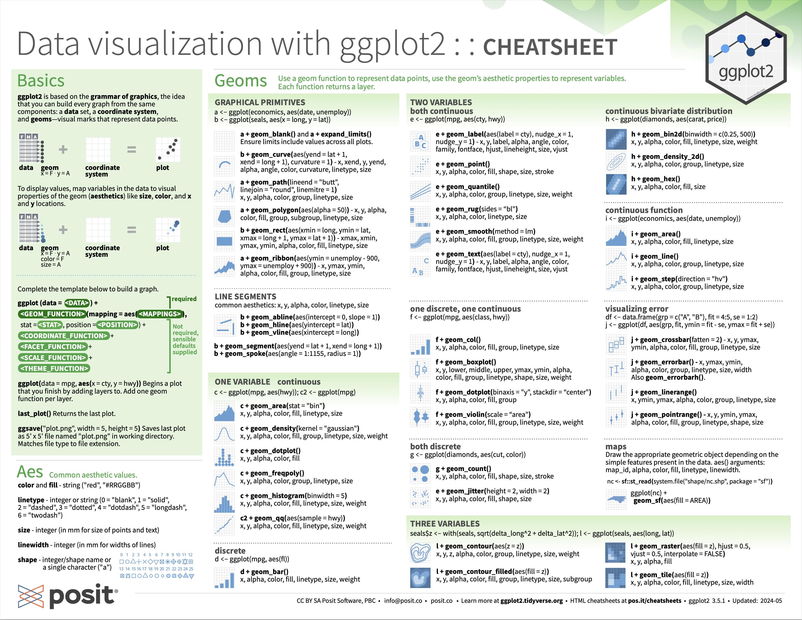
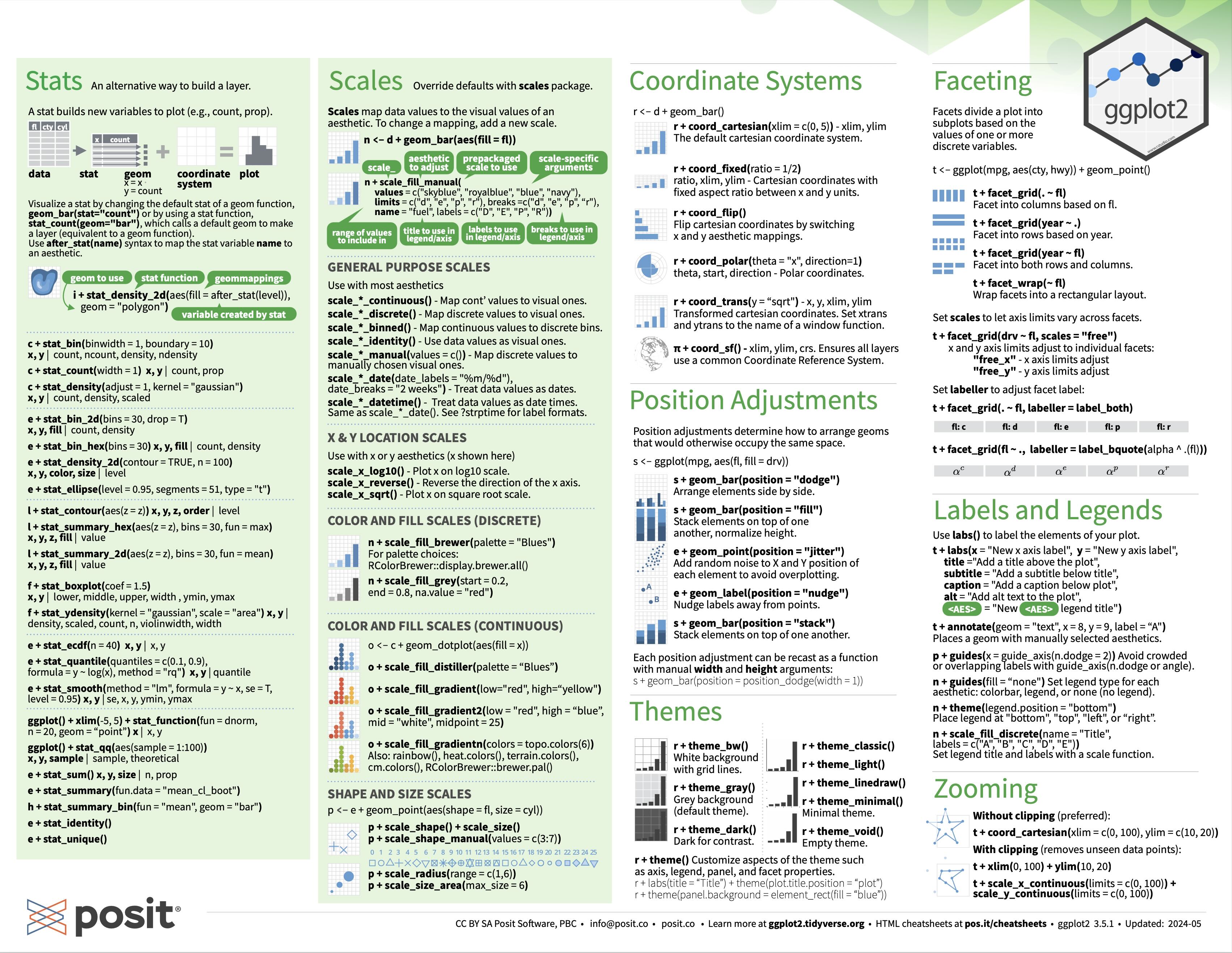
{ggplot2}Einen guten Überblick über die verfügbaren Layers bieten das folgende Cheatsheet:
bill_depth_mm vergleichenpenguins %>%
ggplot(aes(species, bill_depth_mm)) +
geom_violin() +
geom_boxplot(width = .2) +
ggtitle("Verteilung der Schnabeltiefe",
"in den Spezies Adelie, Chinstrap & Gentoo") +
theme_minimal()penguins %>%
ggplot(aes(species, bill_depth_mm)) +
geom_jitter() +
ggtitle("Verteilung der Schnabeltiefe",
"in den Spezies Adelie, Chinstrap & Gentoo") +
theme_minimal()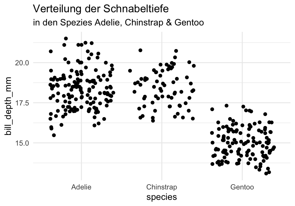
library(ggforce)
penguins %>%
  ggplot(aes(species, bill_depth_mm)) +
    geom_sina() +
    ggtitle("Verteilung der Schnabeltiefe",
            "in den Spezies Adelie, Chinstrap & Gentoo") +
    theme_minimal()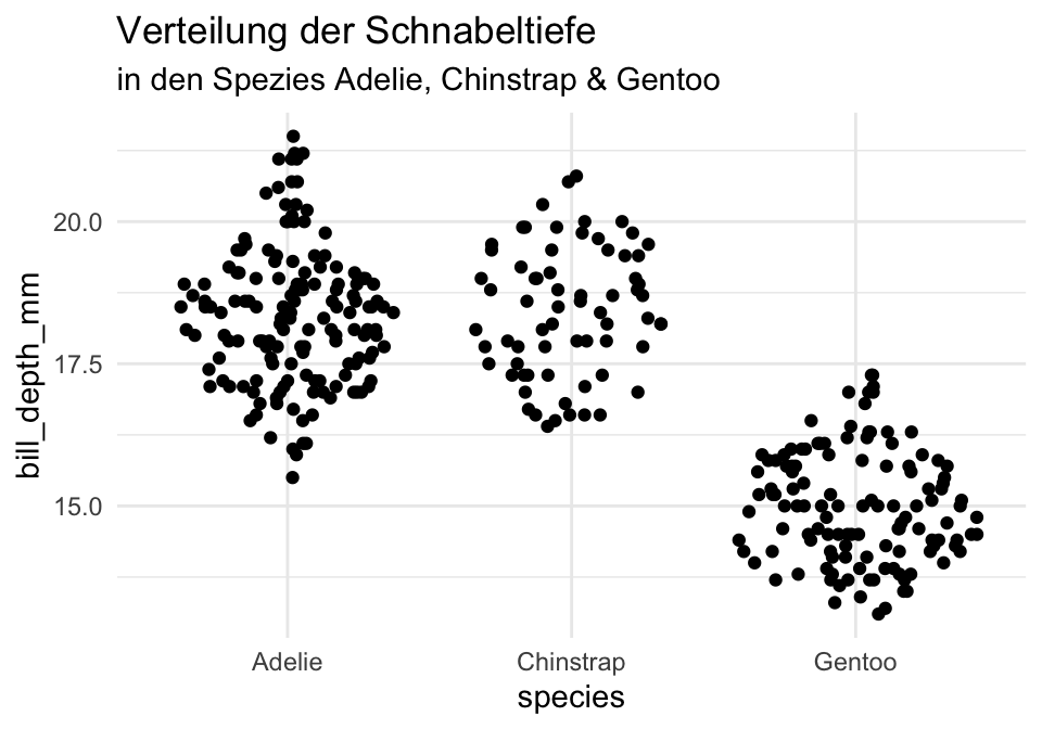
penguins %>%
  ggplot(aes(x = flipper_length_mm,
             color = species,
             fill = species)) +
    geom_density(alpha = 0.5) +
    scale_fill_manual(values = c("darkorange","darkorchid","#267326")) +
    scale_color_manual(values = c("darkorange","darkorchid","#267326")) +
    ggtitle("Verteilung der Schnabeltiefe",
            "in den Spezies Adelie, Chinstrap & Gentoo") +
    theme_minimal()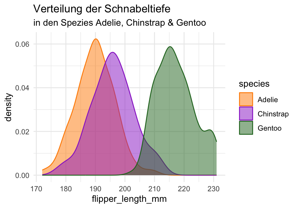
penguins %>%
  ggplot(aes(x = flipper_length_mm,
             color = species,
             fill = species)) +
    geom_histogram(alpha = 0.5,
                   position = "identity") +
    scale_fill_manual(values = c("darkorange","darkorchid","#267326")) +
    scale_color_manual(values = c("darkorange","darkorchid","#267326")) +
    ggtitle("Verteilung der Schnabeltiefe",
            "in den Spezies Adelie, Chinstrap & Gentoo") +
    theme_minimal()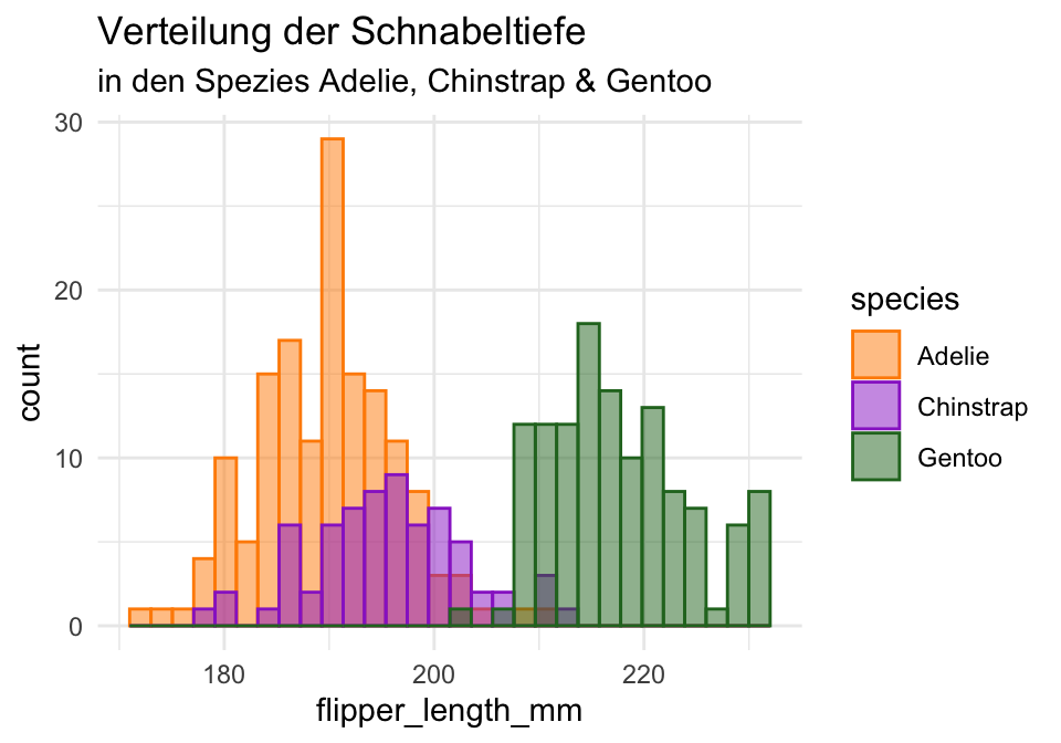
penguins %>%
  ggplot(aes(x = flipper_length_mm,
             color = species,
             fill = species)) +
    geom_dotplot(alpha = 0.5,
                 position = "identity") +
    scale_fill_manual(values = c("darkorange","darkorchid","#267326")) +
    scale_color_manual(values = c("darkorange","darkorchid","#267326")) +
    ggtitle("Verteilung der Schnabeltiefe",
            "in den Spezies Adelie, Chinstrap & Gentoo") +
    theme_minimal()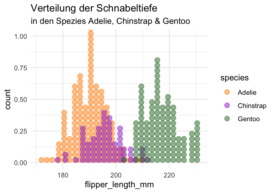
facet)penguins %>%
ggplot(aes(x = flipper_length_mm,
color = species,
fill = species)) +
geom_density(alpha = 0.5) +
facet_wrap(~ species, nrow = 1) +
scale_fill_manual(values = c("darkorange","darkorchid","#267326")) +
scale_color_manual(values = c("darkorange","darkorchid","#267326")) +
ggtitle("Verteilung der Schnabeltiefe",
"in den Spezies Adelie, Chinstrap & Gentoo") +
theme_minimal()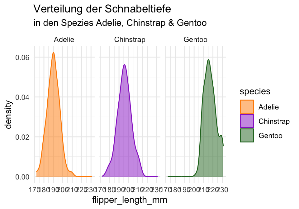
penguins %>%
  ggplot(aes(x = flipper_length_mm,
             color = species,
             fill = species)) +
    geom_histogram(alpha = 0.5,
                   position = "identity") +
    facet_wrap(~ species, nrow = 1) +
    scale_fill_manual(values = c("darkorange","darkorchid","#267326")) +
    scale_color_manual(values = c("darkorange","darkorchid","#267326")) +
    ggtitle("Verteilung der Schnabeltiefe",
            "in den Spezies Adelie, Chinstrap & Gentoo") +
    theme_minimal()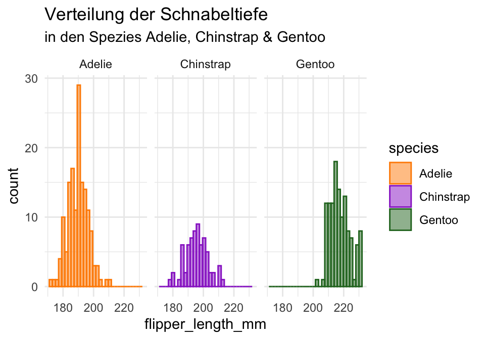
Bauen Sie einige der obigen Grafiken ohne farbliche Enkodierungen nach. Versuchen Sie dazu zunächst nur das Cheatsheet zu nutzen.